You’re probably staring at a messy stack of exports right now. GA4 in one tab, Search Console in another, a rank tracker open somewhere else, and a half-finished slide deck or doc that already feels too long.
That’s usually where bad SEO reports begin.
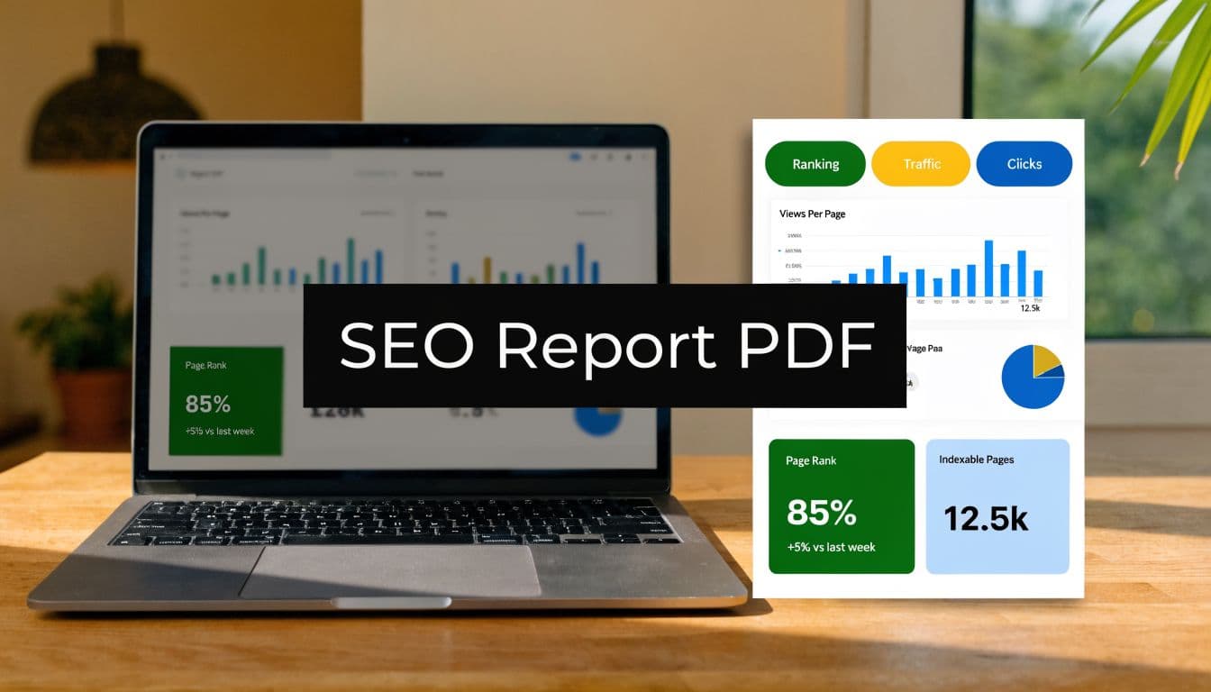
A useful seo report format pdf isn’t a pile of screenshots and metric dumps. It’s a decision document. A client, CMO, founder, or account manager should be able to scan it, understand what changed, why it matters, and what needs to happen next. If they can’t do that, the report is busywork.
The modern version has another requirement. It has to show visibility beyond blue links. Traditional search performance still matters, but a report that ignores how AI systems mention, cite, and recommend a brand is already behind the market.
Beyond Data Dumps Laying the Strategic Foundation
Before you choose charts, decide what argument the report needs to make.
Most junior SEOs build reports backwards. They export whatever the tools offer, then try to organize it into something readable. That creates bloated PDFs full of raw metrics with no point of view. The better approach is simpler. Start with audience, business goal, and decision needed from the reader.

Match the report to the reader
A founder wants a compressed story. They care about momentum, risk, and whether SEO is contributing to pipeline or revenue. A marketing manager needs enough detail to defend priorities internally. A content lead wants page-level and topic-level insight they can act on this week.
If you send the same PDF to all three, one of two things happens. Either the executive tunes out because it’s too detailed, or the operator gets frustrated because it’s too vague.
Use this quick filter before you build anything:
- Executive audience: Keep emphasis on outcome, trend direction, major blockers, and top priorities.
- Marketing leadership: Add channel contribution, landing page movement, conversion context, and competitive changes.
- Practitioner audience: Include keyword groups, technical findings, content opportunities, and implementation notes.
Practical rule: every page in the PDF should help a reader answer one question. What improved, what slipped, what caused it, or what we do next.
A lot of teams struggle here because they’re thinking about format instead of communication. If you want a solid model for that shift, Mastering Client SEO Reporting is worth reading because it frames reporting around stakeholder understanding instead of tool output.
Choose KPIs that prove value
Traffic by itself is rarely enough. It can go up while qualified demand goes down. Rankings can improve for terms that don’t convert. Impressions can grow while the business sees no practical gain.
A better SEO report format pdf uses traditional metrics to explain visibility, then ties them to business metrics that explain value. That’s the difference between “we got more clicks” and “organic search brought the right people to pages that matter.”
| Metric Category | Traditional KPI (The 'What') | Modern KPI (The 'So What') |
|---|---|---|
| Traffic | Organic sessions | Qualified organic visits to high-intent pages |
| Rankings | Average keyword position | Visibility for revenue-driving topics and AI surfaces |
| Engagement | Bounce rate or time on page | Content usefulness and progression to next action |
| Conversions | Total conversions | Organic conversion quality by landing page type |
| Authority | Backlink count | Backlinks that strengthen priority topic clusters |
| Brand presence | SERP visibility | Brand mentions, citations, and recommendation presence in AI outputs |
When I review weak reports, the same pattern shows up. Too many vanity metrics. Too little interpretation. A junior team member will often celebrate a ranking gain for a query that doesn’t matter while ignoring a decline on a pricing or category page that does.
That’s why I like defining report KPIs in three layers:
- Outcome metrics tied to business goals.
- Diagnostic metrics that explain why those outcomes moved.
- Action metrics that show whether the team completed the work likely to affect the next reporting period.
For a practical framework on tying page performance back to outcomes, the guide on measuring content performance is useful because it pushes you past top-line traffic and into page-level value.
Build the narrative before the visuals
A report should read like this:
- What changed
- Why it changed
- What it means
- What we’ll do next
That sequence sounds obvious, but many PDFs skip the middle. They show a chart, then jump straight to a recommendation. Stakeholders see the motion but not the reasoning. Once that happens, trust drops.
Your narrative should also reflect trade-offs. If organic traffic was flat but high-intent page performance improved, say that plainly. If rankings improved but conversion quality didn’t, don’t hide it. Honest reporting is more persuasive than polished reporting.
The Anatomy of a High-Impact SEO Report PDF
What is often needed isn't a clever structure; it's a repeatable one.
A standard SEO report format in PDF typically includes 8 essential sections, with the single-page SEO Results Summary being most critical for stakeholder engagement. These formats are used by over 70% of agencies for client delivery, according to SEOptimer’s SEO report sample PDF guide. That’s a useful baseline because it reflects how agencies package information for clients.

Start with the one page people actually read
The most important page is the opening summary. Not because summaries are fashionable, but because most stakeholders won’t read the entire document closely.
This page should stay tight. It needs four things:
- Performance snapshot: A brief statement of the reporting period’s overall direction.
- Top wins: The few developments that created meaningful business impact.
- Top risks: Declines, blockers, or unresolved technical issues.
- Recommended actions: The limited set of priorities for the next cycle.
The mistake I see most often is overloading this page with tiny charts. If a chart needs explanation, it probably doesn’t belong here. Use short, plain-language bullets instead.
A summary page should work even if the reader never reaches page two.
Build a performance overview that earns the detail below it
After the summary, add a dashboard-style overview. This page gives readers a clean snapshot of overall SEO health before they enter the deeper sections.
Include visual trends for the core metrics you’ve chosen. In most reports, that means some version of clicks, impressions, positions, conversions, and landing page movement. If branded and non-branded performance tell different stories, separate them. If mobile and desktop performance differ materially, separate those too.
A good dashboard page does two jobs at once. It helps a busy reader scan quickly, and it gives the account team a stable reference point when discussing month-over-month change.
If you want a reference structure for recurring client deliverables, this guide to SEO monthly reporting format is a useful companion because it shows how to keep recurring reports consistent without making them robotic.
Give rankings context instead of dumping keyword lists
Keyword sections are where reports often become unreadable.
Don’t paste long exports. Group terms by intent, page type, or topic cluster. Show what moved, which pages benefited, and whether the ranking movement is likely to matter commercially. Include SERP feature ownership and AI Overview presence if those surfaces are relevant to the account.
A strong keyword section usually answers these questions:
| Question | What the report should show |
|---|---|
| Which terms improved? | Topic groups or priority keywords with meaningful movement |
| Which pages gained visibility? | Landing pages associated with those gains |
| Where did visibility weaken? | Declines by page type, topic, or intent group |
| What should the team do? | Refresh content, improve internal links, resolve cannibalization, or expand clusters |
What doesn’t work is listing hundreds of keywords with no interpretation. That’s not reporting. That’s an export.
Separate technical health from on-page quality
A lot of teams blend everything into one giant “SEO issues” section. That makes prioritization harder.
Keep technical SEO and on-page SEO distinct.
Technical should cover crawlability, indexing signals, canonical issues, redirects, HTTPS, robots.txt, sitemap health, page speed, and related infrastructure concerns. On-page should cover title tags, meta descriptions, heading structure, content relevance, image alt text, internal linking, and schema-related implementation as it affects page presentation.
This split matters because the owners are often different. Developers usually own technical fixes. Content and SEO teams usually own on-page improvements. If your structure doesn’t reflect ownership, execution slows down.
Treat backlinks and competitors as decision support
The links section shouldn’t just count backlinks. It should show whether authority is improving around the pages and topics that matter most. Domain-level metrics are useful, but page-level relevance is usually more actionable.
Competitor analysis belongs in the report when it changes your roadmap. Include it when a competitor is outranking key commercial pages, dominating a topic cluster, or earning AI citations you aren’t. Skip generic competitor screenshots that don’t lead to action.
Here’s the practical test. If a section doesn’t change what the team will do next month, cut or shrink it.
End with a ranked action plan
The final section must convert analysis into work.
Use a short list of prioritized actions. Group them by expected impact and implementation difficulty if that helps your audience. Then assign ownership. A recommendation without an owner becomes a suggestion. A suggestion usually dies in the meeting notes.
A strong action plan includes:
- What to do
- Why it matters
- Who owns it
- What outcome you expect to influence
I’d rather see five well-argued actions than twenty vague recommendations. High-impact reports don’t impress readers with volume. They reduce ambiguity.
Integrating AI Visibility and GEO Metrics
A report that only measures traditional search is incomplete now.
That’s not a trend forecast. It’s already visible in how people research products, compare vendors, and ask discovery questions. Reflecting a 35% year-over-year increase in AI-related queries, modern SEO reports now incorporate AI Visibility metrics. By Q1 2026, AI search captured 12% of US queries, making brand mention tracking in models like Gemini essential, as noted in Semrush’s SEO reporting guide.

What belongs in an AI visibility section
Don’t bolt AI data onto the end of the keyword section. Give it a dedicated block in the PDF.
This section should answer a different set of questions than classic SEO reporting:
- Brand mentions: Is the brand being named in AI-generated answers for relevant prompts?
- Citations: Which pages get referenced as supporting sources?
- Recommendation presence: Does the brand appear in shortlist-style or comparison responses?
- Topic coverage gaps: Which important prompts are won by competitors or publishers instead?
- Citation quality: Are AI systems pulling from current, accurate, high-value pages?
Those are not vanity checks. They tell you whether your content is discoverable and usable in an environment where users may never click a blue link first.
GEO is now part of the reporting job
Generative Engine Optimization, or GEO, changes what “visibility” means. It’s no longer enough to rank. You also need to be understood, cited, and recommended by AI systems that synthesize results.
That means your report should reflect content qualities that influence AI retrieval and citation behavior. In practice, I look for clear topical structure, direct answers, source-worthy sections, clean on-page formatting, strong entity signals, and page-level depth that supports extraction.
A useful AI visibility section doesn’t need to be huge. But it does need to be explicit. If your brand appears in search but disappears in AI summaries, the report should say so.
If the client is asking why branded search looks stable while top-of-funnel leads are changing, AI visibility is often part of the answer.
How to present AI metrics without confusing stakeholders
The cleanest layout is a simple scorecard followed by examples.
Start with a concise overview of AI visibility across the platforms you monitor. Then show a few representative prompts with outcomes. Which models mentioned the brand, which cited the site, and which competitor appeared instead. That makes the abstract concept real.
For teams that want to operationalize this, keyword rankings and visibility reporting is a helpful framework because it connects traditional ranking logic with broader visibility measurement.
One practical option here is Sight AI, which monitors how models such as ChatGPT, Gemini, Claude, Perplexity, and Grok mention brands, citations, positions, prompts, and sentiment in one dashboard. That kind of dataset makes the AI section of a report less speculative and more reportable.
The trade-off is straightforward. AI visibility data is newer and less standardized than search console data, so you need to explain the metrics more clearly. But that’s not a reason to exclude them. It’s a reason to present them well.
Design and Visualization for Clear Storytelling
A strong PDF report feels easy to read before anyone reads a word.
That usually comes down to restraint. Too many colors, too many chart types, too many widgets on one page, and the story disappears. Design isn’t decoration here. It’s what keeps the logic visible.

Use visuals to answer one question at a time
Pick chart types based on the decision they support.
- Line charts: Best for trends over time, such as clicks, visibility, or conversions.
- Bar charts: Best for comparisons across pages, topics, or channels.
- Donut or stacked charts: Useful for composition, but only when the categories are few and clear.
- Tables: Better than charts when precision matters more than pattern recognition.
The best reports annotate visuals. If rankings improved after a content refresh, note that on the chart. If a traffic drop aligns with a migration issue or indexing problem, say so beside the visual. A naked chart leaves the stakeholder to guess.
Highlight quick wins clearly
Not every useful insight is dramatic. Many wins come from overlooked basics.
A common reporting pitfall is overlooking structured data, which can boost rich snippets by 30%. Another is image optimization, where 92% of images are often unoptimized, according to this SEO analysis report template guide. Those aren’t glamorous findings, but they belong in a good report because they often produce straightforward next steps.
I like to isolate quick wins in a small callout box instead of burying them in a long audit table. That keeps them visible for stakeholders who want action more than diagnosis.
Useful filter: if a chart looks polished but doesn’t change a recommendation, remove it.
Keep the layout disciplined
Three design rules make most reports better immediately:
- One dominant idea per page. If a page mixes traffic, backlinks, rankings, and technical errors, it’s doing too much.
- Consistent visual hierarchy. Headings, chart labels, callouts, and notes should behave the same way throughout the PDF.
- Whitespace is functional. Dense pages make even good analysis feel harder than it is.
If your report now includes AI search behavior, design matters even more because the audience may not already understand GEO concepts. This explainer on Generative Engine Optimization (GEO) is a good external primer if you need a simple way to explain why these newer visibility surfaces deserve space in reporting.
For teams building dashboard-first reports before export, a strong SEO performance dashboard can make the final PDF cleaner because the hierarchy is already established before you hit export.
Streamlining Your Workflow with Automation and Export
Manual reporting is where good strategy often goes to die.
The logic is sound. The team knows what matters. Then the reporting cycle arrives, and everyone burns hours exporting data, cleaning spreadsheets, pasting screenshots, and fixing formatting issues that should never have existed in the first place.
Automation fixes more than efficiency. It improves consistency.
Build a system, not a monthly scramble
The cleanest workflow usually looks like this:
- Aggregate source data: Pull from GA4, Google Search Console, backlink tools, rank trackers, and technical audit platforms into one reporting layer.
- Standardize templates: Keep the core report structure fixed, then swap KPI blocks based on client type.
- Review exceptions manually: Add commentary where anomalies, strategic changes, or new opportunities require human judgment.
- Export to PDF: Deliver a locked, branded file that preserves layout across devices and inboxes.
Tools like Looker Studio, DashThis, and Swydo are useful because they reduce repetitive handling. They don’t replace thinking, but they remove the repetitive assembly work that drains reporting quality.
According to the benchmark cited in this SEO monthly performance report resource, automated reporting tools can cut data fetch and report assembly time by up to 95%. That same benchmark notes that agencies that standardize their PDF reporting process see stronger stakeholder buy-in and can better track the effect of fast indexing workflows.
Make PDF export the final step, not the working environment
A lot of teams still build reports directly in slides or docs and manually export them to PDF at the end. That’s workable for one client. It breaks when you manage several.
The better model is to create a live reporting system first, then use the PDF as the final presentation layer. That keeps your numbers consistent and reduces version drift. It also makes recurring reporting much easier when leadership asks for the same view every month.
For teams evaluating stack options, this roundup of SEO reporting software reviews helps compare dashboard and export workflows more realistically than vendor pages usually do.
Don’t automate the commentary
This is the trade-off people miss.
Automation should handle collection, formatting, and repeatable layout. It shouldn’t write your strategic judgment for you. The sentence that explains why a category page lost visibility, or why an AI citation gap matters, still needs a human who understands the account.
The strongest workflow is hybrid. Machines gather. Humans interpret. The final PDF should feel deliberate, not auto-generated.
Frequently Asked Questions About SEO Report PDFs
How often should an SEO report PDF go out
Monthly is usually the right cadence for most client and internal reporting because it gives enough movement to interpret without turning the process into noise. Weekly updates can work for active campaigns, migrations, or recovery work, but those are better as lightweight dashboards or status notes than full PDFs.
If the business runs long buying cycles or slower publishing calendars, a monthly PDF with a brief mid-cycle update is often the most practical setup.
How do you customize one report format for e-commerce and local SEO
Keep the structure stable and swap the KPI blocks.
That’s where a lot of agencies lose time. The recurring pain point is niche customization. According to Ahrefs’ SEO report template discussion, agencies using automated dashboards cut reporting time by 80% and improve client retention by 35% by easily tailoring KPIs for e-commerce vs. local SEO clients.
Use one core framework:
- Executive summary
- Performance overview
- Visibility section
- Technical section
- Recommendations
Then customize the middle. E-commerce reports should emphasize category and product page performance, commercial queries, and organic conversions. Local SEO reports should emphasize location pages, map-related visibility, and lead actions tied to local intent.
Should every SEO report include technical findings
Yes, but not every report needs a giant audit.
Most months, the technical section should focus on change, risk, and unresolved issues. If nothing material changed, summarize briefly and move on. Don’t pad the report with low-priority findings just to make it look extensive.
Where should AI visibility go in the PDF
Give it its own section near the middle of the report, after the top-line performance overview and before detailed recommendations.
That placement matters. If you hide AI visibility in a footnote or tack it onto keyword rankings, stakeholders will treat it as optional. It isn’t. It’s part of modern search visibility now.
What’s the biggest mistake junior SEOs make
They confuse completeness with usefulness.
A long report can still fail. If the client can’t tell what changed, what caused it, and what action to approve next, the report didn’t do its job. Brevity with judgment beats volume with no point of view.
If your team needs to report on both traditional SEO and AI search presence without stitching together disconnected tools, Sight AI gives you one place to monitor prompts, mentions, citations, positions, sentiment, and related content opportunities, then turn those insights into publishable SEO and GEO content that can be tracked in the next reporting cycle.