
If you want to improve your website's conversion rates, you have to start with a data-driven audit. It's the only way to truly understand how people are using your site right now and what's stopping them from converting. This means mapping out critical user journeys, pinpointing exactly where people are dropping off, and gathering both quantitative and qualitative data to paint a full picture.
Without a clear baseline, you're just guessing. Effective A/B tests and optimizations are born from solid hypotheses, and solid hypotheses are born from data.
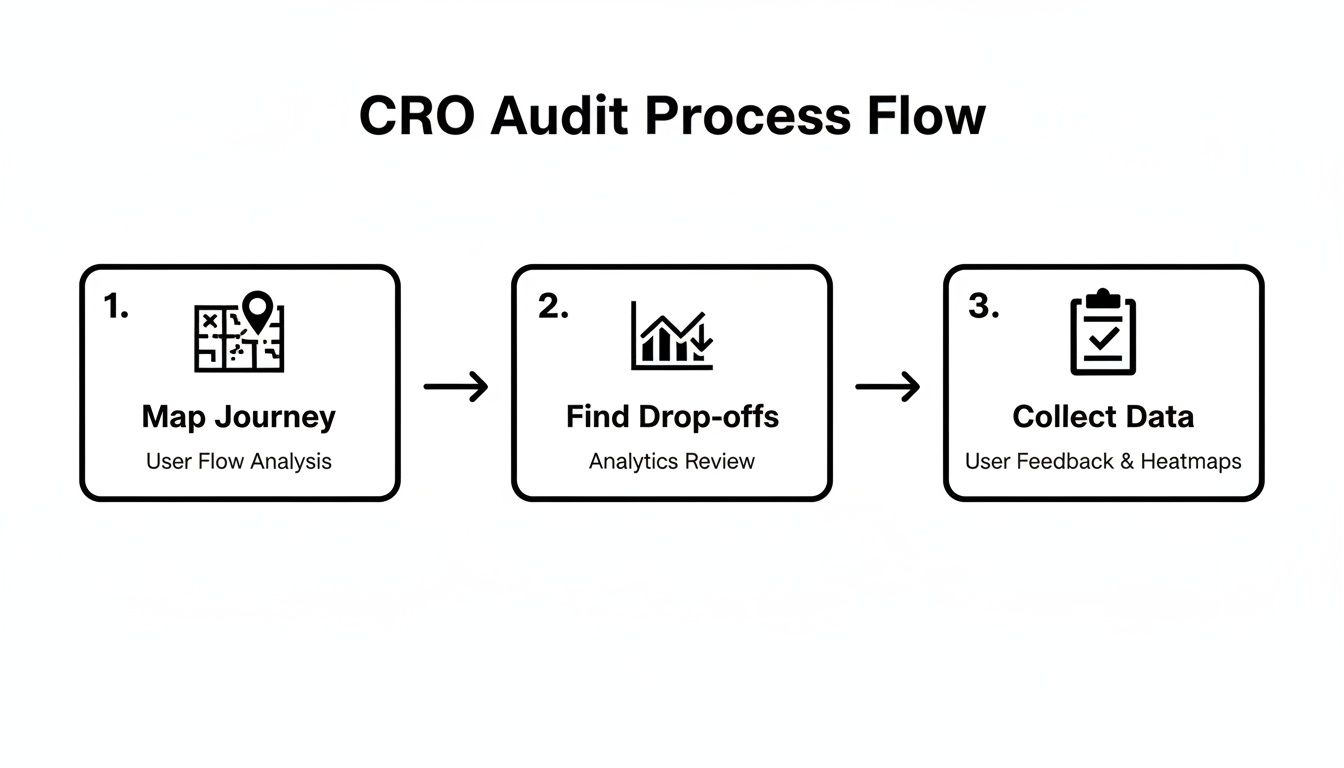
Establishing Your CRO Baseline
Before you can even think about boosting conversions, you need to know where you stand today. Conversion rate optimization (CRO) isn't about guesswork or gut feelings; the entire process is built on a foundation of hard data. This initial audit is honestly the most critical part of the whole playbook. It's where you uncover the friction points that are actively killing your conversions, whether that’s getting someone to buy a product or book a demo.
The whole thing kicks off with a deep dive into your existing analytics. You need to identify your most important conversion funnels—think of the path from a product page to a completed checkout—and figure out where users are giving up and leaving.
This simple flow shows you exactly where to begin: Map the journey, find the drop-offs, and then collect the data to understand why it's happening.
Following this framework ensures you're tackling the biggest opportunities for improvement first, not just chasing minor tweaks.
Gather Your Quantitative Data
Quantitative data gives you the "what" and the "where." These are the hard numbers that point you directly to the problem areas on your site.
Start by digging into your analytics platform, like Google Analytics, to track user flows and behavior. Pay close attention to metrics like bounce rates on key landing pages, exit rates at specific funnel stages, and the average time on page. For a more detailed look at what to measure, check out our guide on the key website metrics to track.
You're hunting for patterns here. Is there a massive drop-off between the "add to cart" and "initiate checkout" steps? Does one particular traffic source have an alarmingly high bounce rate? These numbers are your first clues.
To get started, here’s a quick checklist of the data points you’ll want to gather. This table will help you organize your initial audit and make sure you're not missing any crucial information.
Your Initial CRO Audit Checklist
| Data Point | Tool to Use | What to Look For |
|---|---|---|
| Overall Conversion Rate | Google Analytics | Your site-wide performance baseline. |
| Funnel Drop-Off Rates | Google Analytics, Mixpanel | The percentage of users leaving at each step. |
| Bounce Rate (by Page) | Google Analytics | High-traffic pages where users leave immediately. |
| Exit Rate (by Page) | Google Analytics | The last page users view before leaving your site. |
| Average Time on Page | Google Analytics | Low time on page can signal irrelevant or confusing content. |
| New vs. Returning Users | Google Analytics | Differences in conversion behavior between segments. |
| Device Performance | Google Analytics | Conversion rate discrepancies between desktop, mobile, tablet. |
Gathering this data gives you a solid, numbers-based foundation. Now you know where the problems are, but you still need to figure out why they're happening.
Uncover The 'Why' With Qualitative Insights
While the numbers tell you what is happening, qualitative data explains why. This is where you step into your users' shoes and see your site through their eyes.
By combining quantitative data with qualitative insights from session recordings and heatmaps, you move from simply identifying a problem to truly understanding the user frustration behind it.
Tools like Hotjar or Microsoft Clarity are absolute goldmines for this. Session recordings let you watch real user journeys, often revealing confusing navigation or broken elements you had no idea existed. Heatmaps show where people are clicking, moving their mouse, and scrolling, highlighting which parts of your page are grabbing attention and which are being completely ignored.
As you build your baseline, it's also helpful to look at how the pros do it. Consulting a data-driven playbook for ecommerce conversion rate improvement can show you how top brands apply these same principles.
Finally, remember to benchmark your performance. The average website conversion rate across all industries hovers around 2.35%, but the top-performing sites are hitting 5.31% or more. This context helps you set goals that are both realistic and ambitious enough to make a real impact.
Turning Data Into Testable Hypotheses
So, you’ve finished your initial audit and now you're sitting on a mountain of data. That's great, but raw numbers, click maps, and analytics reports don't magically improve conversion rates on their own. The real work begins now: translating those quantitative and qualitative insights into powerful, testable hypotheses. This is where you connect the dots between what users are doing and a potential solution you can test.
You have to look beyond the surface-level metrics. A high bounce rate on a product page is just a symptom; your job is to play detective and diagnose the root cause. Is the value proposition falling flat? Is the "Add to Cart" button camouflaged on the page? This is where your qualitative data becomes your most valuable asset.

Synthesizing User Behavior Insights
Start by immersing yourself in the user experience. I always tell people that session recordings are a goldmine for this. There's nothing quite like watching a real person struggle to find the shipping info or repeatedly click on an element that isn't even a link. It builds an incredible amount of empathy and gives you crystal-clear clarity. You’re no longer just guessing; you're witnessing the exact friction points firsthand.
Heatmaps, on the other hand, give you that broader, aggregated view. They show you in an instant which parts of a page are grabbing all the attention and which are being completely ignored. If your main CTA is sitting in a "cold" blue area of the heatmap, that’s a dead giveaway that users aren't even seeing it. This kind of visual data is also incredibly persuasive when you need to get buy-in from the rest of your team.
A powerful hypothesis isn't a random guess. It's an educated, data-backed statement that connects a specific change to an expected, measurable outcome based on observed user behavior.
Uncovering Hidden Intent with AI
Modern tools can add another fascinating layer of insight by revealing what your audience is thinking before they even land on your site. For example, AI visibility platforms can show you the actual questions your target audience is asking large language models like ChatGPT.
Analyzing these prompts gives you an unfiltered look at user intent. You can spot gaps in your content that competitors haven't even thought about yet. For instance, if you discover people are constantly asking AI, "how to integrate [your product] with Salesforce," but your website doesn't have a clear landing page answering that question, you've just stumbled upon a massive conversion opportunity. The return on investment for creating that kind of targeted content can be huge, which is something we dive into deeper in our guide on measuring content marketing ROI.
Crafting a Strong Hypothesis
With all your insights gathered, it’s time to formalize your ideas into a structured hypothesis. A weak hypothesis is vague and uninspired, like, "Making the CTA button bigger will get more clicks." A strong one is specific, measurable, and rooted in a solid observation.
A proven framework I always come back to is: If I [implement this change], then [this outcome will occur], because [of this data-backed reason].
Let’s look at a couple of real-world examples that bring this framework to life.
- Observation: Session recordings show that 70% of users on mobile scroll right past the main CTA button on the pricing page without even pausing.
- Hypothesis: If I change the CTA button to be a sticky element that remains visible at the bottom of the screen on mobile, then sign-ups will increase by 15%, because the primary action will always be accessible as users scroll.
Here's another one:
- Observation: Heatmap data reveals users are repeatedly clicking on an icon that isn't a link, which points to a design flaw and user frustration.
- Hypothesis: If I make the "Key Features" icon clickable and link it to the features section, then the bounce rate on the homepage will decrease by 10%, because it will resolve a point of confusion and help users find the information they’re looking for.
This structured approach transforms your data from a simple report into a strategic roadmap. Each hypothesis becomes a mini-experiment designed to prove (or disprove) an assumption and get you one step closer to a higher-converting website.
So, you’ve done the deep dive, sifted through the data, and now you have a solid list of hypotheses ready to go. This is where the real work begins. Moving from analysis to action is exciting, but it's easy to get lost in the weeds without a plan.
Simply running a bunch of random tests is a recipe for wasted traffic and confusing results. To really move the needle on conversions, you need a disciplined, structured A/B testing program. It’s about building a repeatable process that turns your educated guesses into a powerful growth engine for your business.
Prioritizing Your Test Ideas
Let's be real: not all ideas are winners. You might have a dozen brilliant hypotheses, but your traffic and development resources are finite. That’s why a prioritization framework is your best friend—it takes the guesswork and team politics out of the equation.
A simple but incredibly effective model I always come back to is the PIE framework. It helps you score each test idea against three core criteria:
- Potential: How much of an impact could this change actually have? A new headline on your homepage is going to have way more potential than changing the button color on a forgotten FAQ page.
- Importance: How valuable is the page you're testing? Optimizing the final checkout step is mission-critical because every visitor there has sky-high purchase intent. It’s your most valuable traffic.
- Ease: How much of a headache will this be to implement? A quick copy change is a walk in the park compared to a full-blown navigation redesign that needs design, dev, and QA resources.
Score each factor from 1 to 10, add them up, and voilà. You now have a ranked list that helps you focus on the highest-impact, most achievable wins first.
Choosing the Right Testing Method
The term "A/B testing" gets thrown around a lot, but there are a few different flavors, and picking the right one is key to getting clean, reliable data.
- A/B Testing: This is your classic, go-to method. You’re pitting one variation (Version B) against the original (Version A). It’s perfect for testing specific, isolated changes like a new call-to-action, a different headline, or a fresh hero image.
- Split Testing (or Split URL Testing): This is for the big stuff. When your proposed changes are so massive they live on a completely different URL, you use a split test. Think of it as pitting two entirely different landing pages against each other. It’s the right tool for a major redesign.
- Multivariate Testing (MVT): This is the advanced move. MVT lets you test multiple changes on a page simultaneously to find the winning combination. For instance, you could test three headlines and two CTA buttons at the same time. It’s powerful, but be warned: it requires a ton of traffic to work properly.
For most teams just getting into a testing rhythm, stick with classic A/B testing. It’s simpler to set up, the data is easier to interpret, and you don’t need massive traffic volumes to get clear, actionable insights.
Executing a Clean and Valid Test
You’ve got your prioritized idea and your chosen method. Now for the most critical part: execution. A poorly run test is worse than no test at all because it can lead you to make changes that actually tank your conversions.
Building a structured process is non-negotiable. If you want to get systematic about it, our guide on how to create workflows offers a great framework that you can easily adapt for your CRO program.
Here’s a quick checklist I use to make sure every test I run in a tool like VWO, Convert, or Google Optimize is sound:
- Define a Single, Clear Goal: What’s the one metric that decides the winner? Is it form submissions? Click-through rate? Revenue per visitor? Pick one primary goal and stick to it.
- Calculate Your Sample Size: Don’t guess. Use an online calculator to figure out how many visitors you need for each variation to get a statistically significant result. This stops you from calling a test too early.
- Run for Full Business Cycles: Always run a test for at least one full week, but two is even better. This smooths out any weirdness from weekday vs. weekend traffic behavior.
- Aim for 95% Statistical Significance: This is the magic number. Don't declare a winner until your testing tool tells you it's at least 95% confident that the results aren't just random luck.
Following this structure is what separates the pros from the amateurs. It moves you from just "running tests" to building a high-impact program that consistently drives real, measurable growth.
Actionable On-Page Optimizations That Convert
Once you have a solid testing plan in place, it's time to get your hands dirty with the on-page elements that make or break conversions. This is where the magic happens. Improving your website's conversion rate often boils down to making smart, targeted tweaks on your most critical pages—the small changes to design, copy, and user flow that can lead to huge wins.
We’re going to walk through the anatomy of a high-converting page, from the moment a visitor lands all the way through the CTA, forms, and the final checkout. Each step is a chance to remove friction and build momentum toward that all-important conversion.

Deconstructing The High-Performing Landing Page
Think of your landing page as your digital sales pitch. From the second it loads, every single element has to work in harmony to grab attention, prove your value, and steer the user towards one clear action. A page that feels disjointed or confusing is a surefire way to kill conversions.
Those first five seconds are everything. Your hero section—the combination of your main headline, sub-headline, and hero image—does all the heavy lifting. The headline's job is to instantly answer the user's biggest question: "Am I in the right place?" It needs to be sharp, compelling, and perfectly aligned with whatever ad or link brought them there.
Beyond the headline, you need to build credibility fast. This is where social proof and trust signals come in.
- Customer Testimonials: Use short, punchy quotes from real customers that speak directly to a pain point.
- Case Study Snippets: Highlight impressive results like "Boosted lead flow by 45%" and link out to the full story.
- Company Logos: If you've worked with well-known clients, show them off. Their brand authority rubs off on you.
- Security Badges: Place trust seals from known security providers near any form or checkout button. It’s a small detail that provides a lot of reassurance.
For some fantastic real-world examples, take a look at the best landing page designs that skyrocket conversions. Pay close attention to how they weave these elements together to create an experience that feels both persuasive and trustworthy.
Crafting Calls-to-Action That Demand a Click
Your Call-to-Action (CTA) is probably the single most important element on the entire page. It’s the final gateway. A weak or fuzzy CTA can bring an otherwise perfect user journey to a dead stop. Generic phrases like "Submit" or "Learn More" are conversion poison because they lack urgency and clarity.
The best CTAs use strong, action-oriented verbs that tell the user exactly what’s going to happen. Instead of "Submit," try "Get My Free Quote." Instead of "Learn More," go with "See Pricing Plans." This isn't just semantics; it's about reducing uncertainty and giving the user confidence to click.
Your CTA button shouldn't just be a button; it should be the logical conclusion to the story you've told on the page. The copy, color, and placement all work together to make clicking feel like the natural next step.
Design is also a huge piece of the puzzle. Your main CTA button needs to pop. Use a contrasting color that grabs the eye, make sure it’s big enough to be tapped easily on any device, and give it plenty of white space to breathe.
Optimizing Forms to Eliminate Friction
Every single field you add to a form is another piece of friction, another reason for someone to give up and leave. We’ve all been there. Long, intimidating forms are notorious conversion killers. Your goal should be to make filling them out as quick and painless as humanly possible.
Start by doing a ruthless audit of your current forms. For every field, ask yourself: "Do I absolutely need this information right now?" For a newsletter signup, an email is all you need. For a lead form, maybe a name, email, and company is enough to get the ball rolling. You can always ask for more info later.
Here are a few tactics that work time and time again:
- Cut down the fields. Seriously. One famous study showed that reducing form fields from 11 to 4 can boost conversions by a staggering 120%.
- Use inline validation. Give people real-time feedback. A green checkmark for a correct entry or a clear red error message for a mistake prevents that final, frustrating "error on page" moment.
- Offer social logins. Letting people sign up with a Google or LinkedIn account is a game-changer, especially on mobile where typing is a pain.
Streamlining the E-Commerce Checkout
For any e-commerce site, the checkout is the final boss. The average cart abandonment rate is hovering around 70%. Think about that—most people who add items to their cart never actually buy them. This is a massive, flashing opportunity for growth.
One of the biggest offenders? Forced account creation. One study found that 24% of users will abandon their cart if you make them create an account. The fix is simple: always offer a prominent guest checkout option.
Unexpected costs are the other major culprit. High shipping fees or surprise taxes that only appear at the very end are the #1 reason for cart abandonment. Be transparent with all costs upfront, either on the product page or right at the start of the checkout flow. Many stores have found that offering free shipping—even if they have to bake that cost into the product price—provides a huge conversion lift. Nailing the persuasive messaging here is critical; our guide on copywriting for a website has some great tips you can apply directly to your product and checkout pages.
Using Personalization to Boost Conversions
A generic, one-size-fits-all website just doesn't fly anymore. If you want to see real movement in your conversion rates, you have to start treating visitors like individuals, not just another number in your analytics dashboard. This is all about delivering personalized journeys that feel relevant and genuinely helpful from the second they land on your site.
The goal here is to shift from static pages to dynamic, living experiences. When you segment your audience based on who they are and what they've done, you can serve up messaging, offers, and content that hits home on a much deeper level. This isn't about being creepy; it's about being more useful.
Audience Segmentation Strategies
Great personalization always starts with smart segmentation. You can group your audience based on all sorts of data points, which lets you dial in the experience with some serious precision. You're trying to figure out who this person is and what they probably want from you.
Here are a few practical ways I like to slice up an audience:
- Traffic Source: Someone who clicked a LinkedIn ad about your B2B features has a completely different mindset than someone who came from a glowing product review blog. You should greet them differently. Tweak the landing page headline and hero image to mirror the ad or article they just left.
- Behavioral Data: Pay attention to what people do on your site. Have they visited your pricing page three times in the last week? Maybe it's time to show them a pop-up offering a quick 15-minute demo. Did they ditch a full shopping cart? A follow-up email with a small "come back" discount can work wonders.
- Demographic and Firmographic Info: For B2B, this is gold. You could show different case studies based on the visitor's company size or industry. For an e-commerce store, it might mean highlighting products that are trending in the visitor's specific city or region.
Putting Personalization into Practice
Once you have your segments mapped out, the fun begins. One of the most effective tactics is dynamic content replacement. This just means swapping out specific elements on a page—like headlines, images, or CTAs—to match who's looking. For instance, a SaaS company could instantly change its headline from "The Ultimate Project Management Tool" to "Project Management for Creative Agencies" if they know the visitor is from that world.
Another huge win is personalized recommendations for products or content. By looking at a user's browsing history, you can surface other articles or items they’re almost guaranteed to be interested in. This isn't just a better user experience; it's a proven way to bump up average order value by creating perfectly-timed upsell and cross-sell opportunities. To see how AI can help create this kind of tailored content at scale, check out this guide on using an AI article generator.
Personalization works because it directly answers the user's unspoken question: "Is this for me?" When the answer is a clear 'yes', the path to conversion becomes significantly smoother.
Don't Let Technical Issues Kill Your Strategy
Listen, even the most brilliant personalization strategy will fall flat on its face if your website is slow, buggy, or a nightmare to use on a phone. A personalized offer on a page that takes five seconds to load is an offer that will never be seen. Technical performance isn’t some separate IT task; it's a core pillar of CRO.
Your site’s speed and mobile experience are completely non-negotiable. Google's Core Web Vitals (CWV) are the perfect example of metrics that sit right at the intersection of SEO and CRO. A lousy CWV score doesn't just ding your rankings; it’s a giant red flag for a frustrating user experience that absolutely crushes conversions.
Nail these technical fundamentals:
- Optimize Page Load Speed: Compress your images, use browser caching, and get rid of any heavy, unnecessary scripts. Every millisecond counts. Studies have shown conversion rates can drop by over 4% for each additional second of load time.
- Ensure a Flawless Mobile-First Design: The majority of your traffic is probably on a phone, so your site needs to be perfect on a small screen. Test your forms, buttons, and menus on different devices to make sure there are no frustrating pinch-and-zoom moments.
- Streamline Your Code: Bloated, messy code can bog down even the fastest servers. Work with your developers to build on a clean, efficient foundation that can handle dynamic content without any lag.
At the end of the day, technical excellence is what allows your personalization efforts to actually work. Combine a tailored user journey with a fast, seamless technical backbone, and you’ve built a powerful engine for driving conversions.
Got Questions About Improving Your Website's Conversion Rate?
When you're deep in the weeds of conversion optimization, questions are going to pop up. It's just part of the process. One minute you’re auditing your site, the next you’re trying to figure out if your A/B test is even working.
This section is all about tackling those common questions we hear all the time. Think of it as a quick-reference guide to get you unstuck and back on track.
What Is a Good Website Conversion Rate, Anyway?
This is the big one, and the honest answer is... it depends. There's no single magic number that works for everyone. A "good" conversion rate is completely tied to your industry, what you're selling, and what you're even counting as a conversion.
Sure, you'll see the average website conversion rate floating around 2.35%, with top-tier sites hitting 5% or more. But an e-commerce store might be thrilled with a 3% purchase rate, while a B2B company could realistically aim for 10% on a high-value demo request form.
The best thing you can do is stop chasing a universal number. Start benchmarking against yourself. Your real goal should be steady, continuous improvement, month over month. That’s what a healthy optimization program looks like.
How Long Should I Run an A/B Test?
How long you run a test comes down to one thing: traffic. Your goal is to gather enough data to hit statistical significance—usually a 95% confidence level. This is just a fancy way of saying you're pretty sure the results aren't a random fluke.
Pulling the plug on a test too early just because one version is ahead is a classic mistake that leads to bad data.
A good rule of thumb is to let every test run for at least one full business cycle. That's typically one or two weeks. This simple step helps smooth out the natural ups and downs in user behavior between weekdays and weekends, giving you a much clearer picture of what’s actually happening.
What Are the Biggest Conversion Killers on a Website?
Across thousands of websites, we see the same handful of issues pop up again and again, absolutely tanking conversion rates. Fixing these friction points is almost always the fastest way to get a meaningful lift.
Here are the usual suspects:
- Slow Page Load Times: Every second counts. Impatient users will just leave, and that conversion is lost forever.
- Confusing Navigation: If people can't find what they're looking for, they'll get frustrated and bounce. It’s that simple.
- Unclear Calls-to-Action (CTAs): Vague buttons like "Submit" or "Click Here" are poison. They create uncertainty right when you need a user to act.
- Unexpected Costs at Checkout: Surprise shipping fees and taxes are the #1 reason people abandon their shopping carts. Be upfront.
- Long and Complicated Forms: Every extra field you ask for is another reason for someone to give up and leave.
- A Lack of Trust Signals: No customer reviews? No security badges? No clear privacy policy? You're making potential customers nervous, and nervous people don't convert.
How Does AI Help With Conversion Rate Optimization?
Artificial intelligence is completely changing how we approach CRO. It’s making it possible to automate incredibly complex data analysis and find insights a human analyst could easily miss. AI-powered tools can sift through thousands of user session recordings to spot the subtle behaviors that scream "I'm confused!" or "This is frustrating!"
This tech is also what's behind the advanced personalization engines that can change website content on the fly for different visitors.
Even more, platforms like Sight AI are giving us a new window into user intent by showing the exact questions people are asking AI models about an industry or product. This lets you create content that perfectly matches what they need before they even get to your site, turning those AI insights directly into a powerful conversion strategy.
Ready to turn AI-powered insights into a real conversion strategy? Sight AI shows you what your audience is asking AI, uncovers critical content gaps, and helps you create SEO-optimized articles that drive targeted traffic. See how leading brands get discovered and start your journey at https://www.trysight.ai.